Defining content
behaviors in augmented reality
Augmented Reality (AR) design is much like traditional flat screen design, except for a few additions: where and when content is placed, the ability to use depth, feedback based on user and physical world conditions, and most importantly, how content behaves. Continue on to see how we designed, prototyped, and codified all new behavior sets to account for expansive use cases across a vast range of user body types and input options.
Historical Behaviors
Before I joined Magic Leap, the design team had haphazardly defined a few behaviors, but terms and definitions were limited to pinpointed experiences and customized for specific use cases. When I arrived on the scene, I noticed that the numerous teams (hardware, software, audio, design, security, etc.) didn’t have a shared language or understanding to describe how digital content behaves based on user movement or environmental conditions. During many meetings, we spent half our time ensuring everyone was talking about the same behavior. Additionally, enterprise use cases called for more extensive user movement across large-scale interior spaces. As the design lead for the Core OS, I felt that it was my responsibility to step in and help codify behaviors and to proselytize these definitions across the entire organization.
Codifying Behaviors
I started digging into competitors' developer documentation to see if any other individuals or companies had codified behaviors. Surprisingly, I didn’t find anything.
I then began reviewing the ML1 experiences and documentation, as well as competitor comparables (HoloLens, Oculus, AR glasses). I found that the best way for me to move forward was to critique all the experiences across ML1, identify commonalities, missed opportunities, what was done well, and what suffered, and then mine our competitors’ documentation. This exercise helped me wrap my head around the problem, which turned out to be rather complex.
The number of behavior options I identified, distances in z, input modalities, personal versus social distances, work and task spaces, best practices, and XR sensor systems all play a role. So how do I codify behaviors in a way that is simple to learn and easy to pass on to both internal Magic Leap developers and external developers?
Discovery
I found that I needed to build four structures to define and judge criteria in order to get to prototyping and user testing stages: goals, OS system structure, user level of engagement structure, and finally a behavior structure.
Goals for AR behaviors
Respect the workflow
They should enhance a user’s ability to accomplish their goal, but not block them from their current task.
Behaviors should inform and enable easy access, but not introduce unnecessary or repetitive steps. Keep users in their “Flow”.
Respect the environment
Users are aware of and often utilize their real-world environment for work.
Content and information are an enhancement to the real-world environment but are not in charge.
Every pixel drawn on-screen covers up the real world. Be disciplined in the use of UI real estate.
Augmented Reality is not lonely
There are often other people in a user’s environment.
Behaviors should work with social norms; they should not force users into interaction patterns that cause awkward social situations.
I created and used these goals to judge success. My criteria later became the foundation for Magic Leap’s AR Principles.
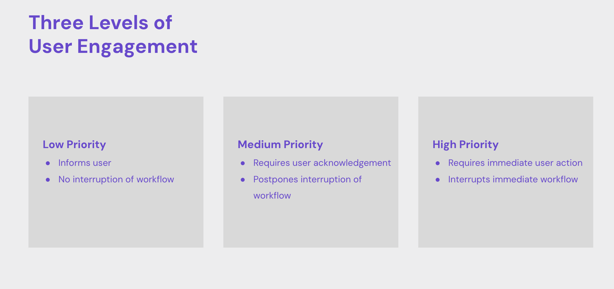
Level of engagement
Head-mounted computing platforms must be conscientious about when and where content is placed. Every pixel covers up a user’s view, and every element can distract from tasks and workflows, many of which have nothing to do with augmented reality. Simplifying engagement into three categories helped me build a mental model that I could overlay on top of content behavior characteristics.
The “level of engagement” helped define the amount of focus required by a user, and then overlaid on their assigned behaviors.
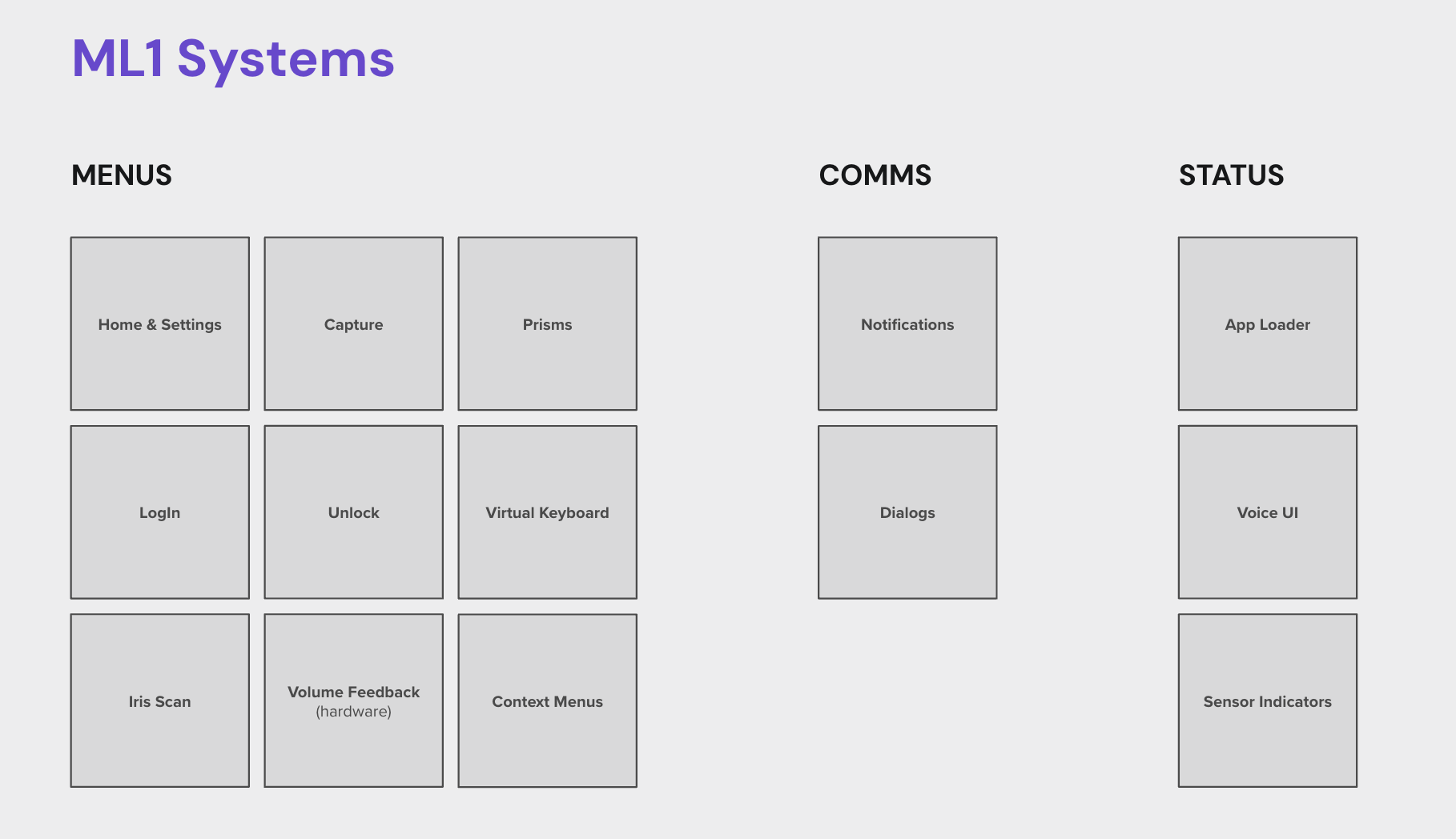
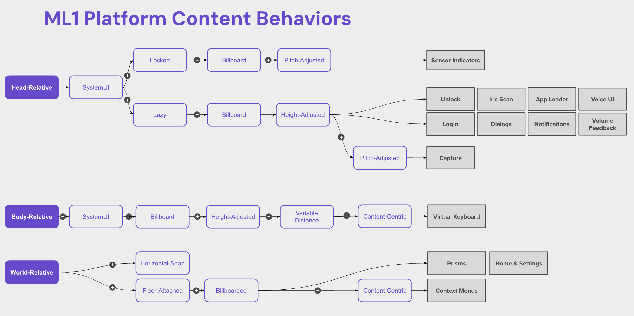
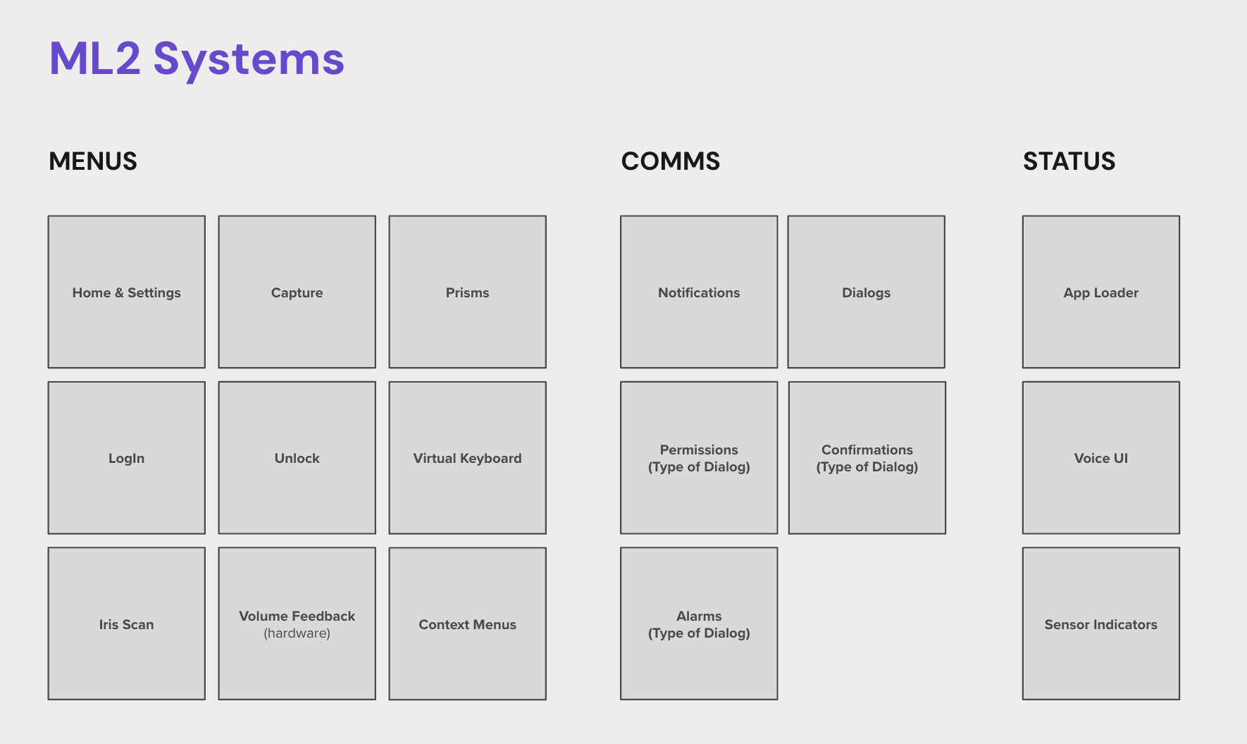
OS system structure
Behavior structure
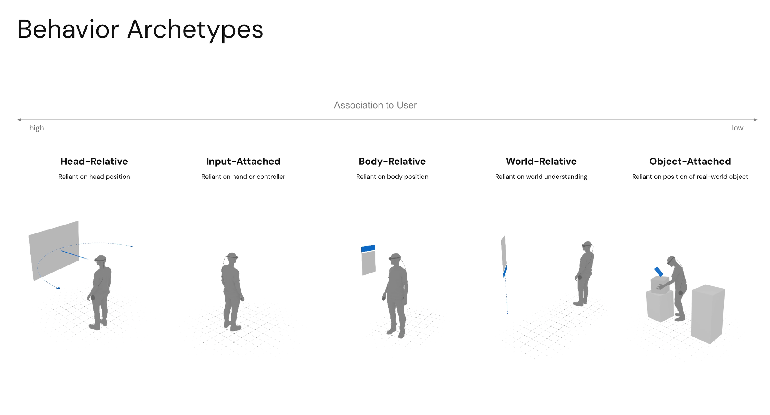
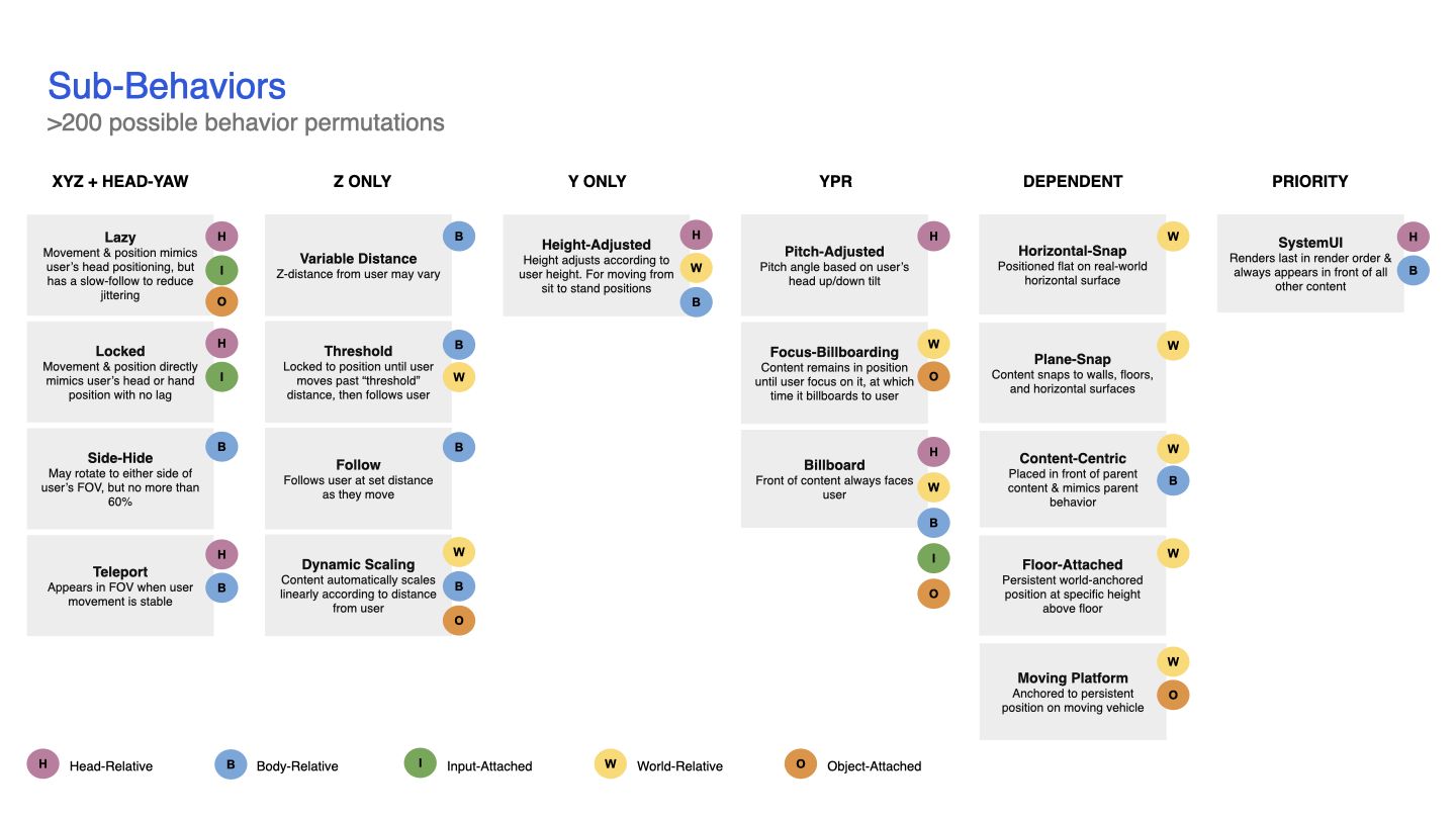
An early structure began to emerge by breaking down major archetypes and adding sub-behaviors. My goal was to keep it simple so that the structure would be easy to share and survive the “telephone test”. In the end, five behavior archetypes were defined: Head-relative, Body-relative, World-relative, Input-attached, and Object-attached. I then broke down behavior attributes, such as billboard, height-adjusted, lazy-follow, dynamic scaling, etc., into sub-behaviors since they had commonalities across multiple behavior archetypes. After reviewing this structure through internal design critiques, I found it an easy way to understand the myriad of options. After all, there are over 200 possible behavior/sub-behavior combinations. See the final Behavior structure.
Early findings
Once the basic structure was built, I layered on speculative design for distance, user macro/micro movement, inputs, and user or world association. This early testing was just me, paper testing, a tape measure, spending quality time with early ML1 QX testing documentation, and more closely watching people in real-world scenarios, such as interacting with in-store kiosks.
Observations
Users need stable content to read, decide, and interact with content, but at the same time, they need to be able to navigate across a room or between rooms. Content needs buffers (I call these micro-movement buffers) in X and Z to account for head bobbing, lean-ins, and weight shifting, and rotation buffers in rotation and Z to account for swaying or looking at content from a slight angle. Consequently, if a user moves from sitting to standing or traverses a room, the content associated with the user needs to move with the user (I call these macro-movement tethers).
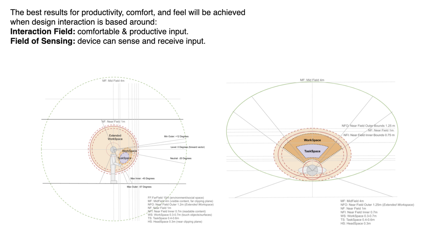
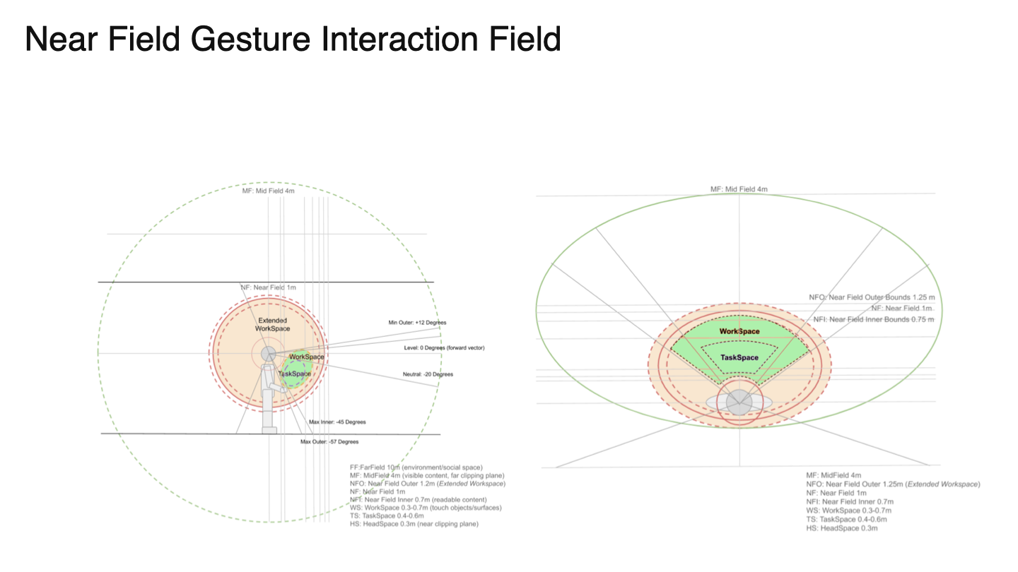
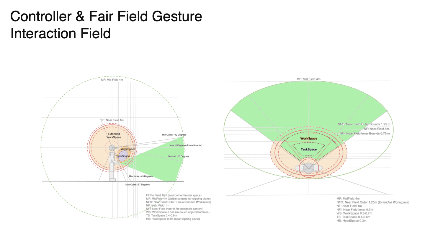
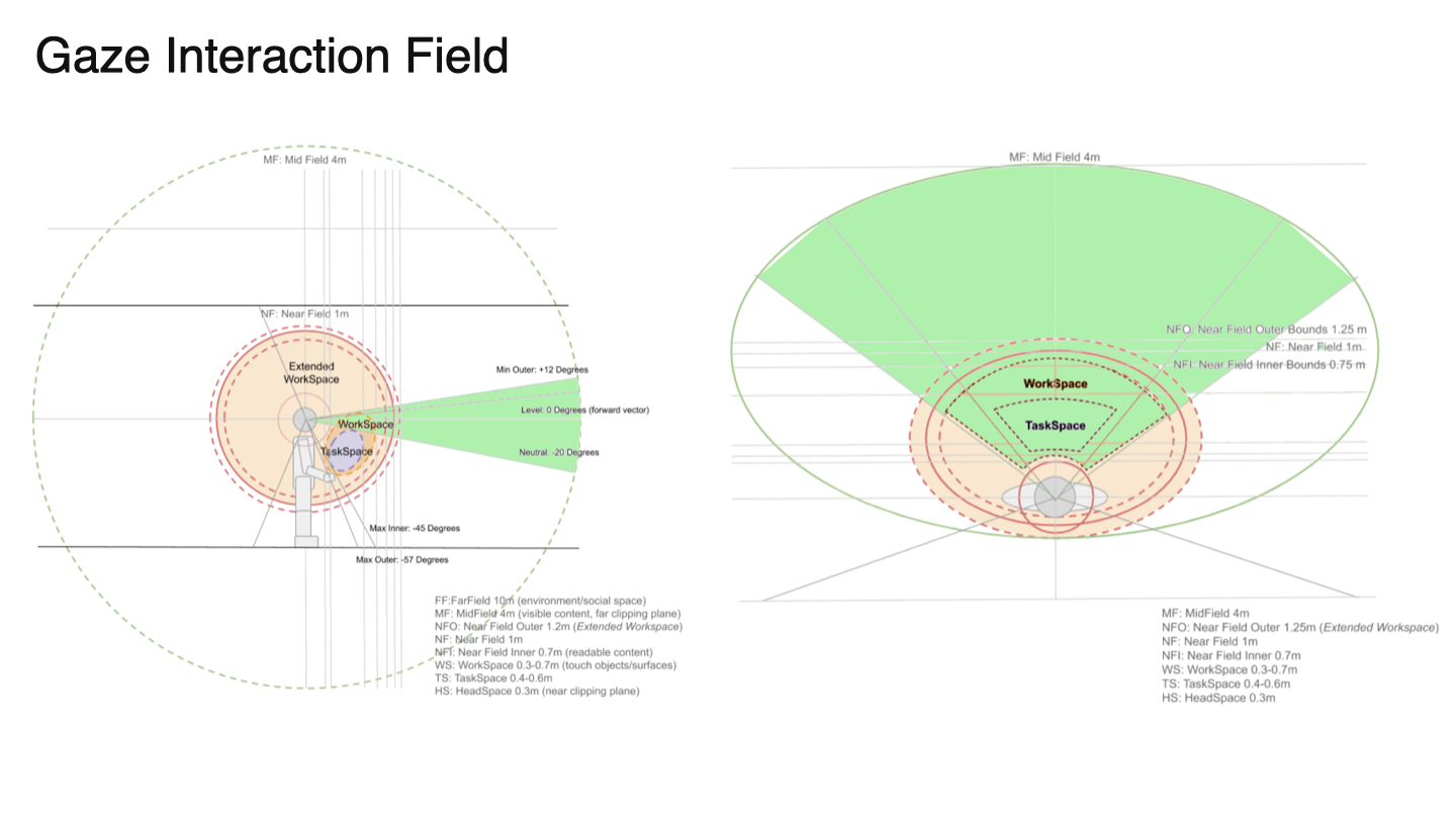
Interaction zones can be broken down into Task Space (general tasks that control an experience) and Work Space (the area where the experience takes place). I didn’t come up with these terms; they came from early ML1 QX testing and studies.
These early findings along with the behavior archetypes and sub-behaviors filtered down into the first prototype.
User testing
I worked with our UX engineering team to create prototypes with a wide range of customizations. Using Home, notifications, and dialogs as digital content representation, testers could adjust behavior archetypes, sub-behaviors, and buffers. I then spent time with each tester running them through options and asking questions about comfort, movement, and expectations.
Testing results were synthesized and organized, and designs were updated accordingly. These designs were brought into a protocol for external testers, and simpler prototypes were created. I provided “wants and needs” to our UX research team, who developed protocols and conducted content behavior testing with users ranging from inexperienced to experienced AR users. A series of use-case workflows was simulated while interacting with digital content using predefined behaviors. Results were pulled into final design categorizations, recommendations, and best practices.
External user testing findings
Users shift forward when interacting with content.
Users get fatigued within five minutes of interacting with content if they have to lift their hand(s) using their shoulder (we call this “ape arm”).
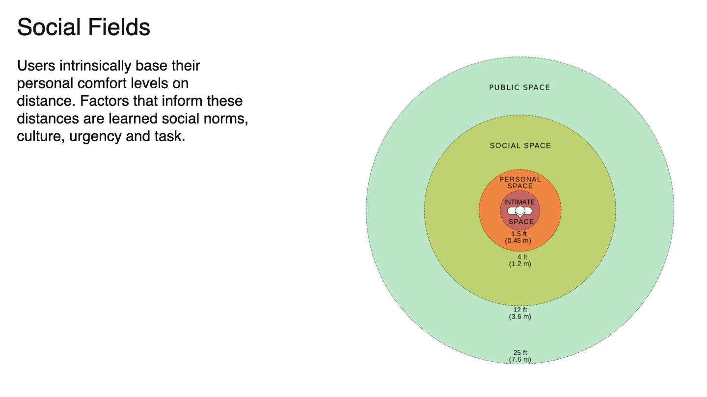
Users are comfortable interacting with content between 0.5m - 0.65m for near-field input and between 0.8m - 1.5m for far-field input.
Users tend to lean or sway side-to-side up to ~4 degrees, but they expect content to remain stable out to 12 degrees.
Content that constantly billboards to the user, especially if there are multiple large-scale elements, is creepy. Users said, ”it felt like the menus were looking over their shoulders”. This feedback ultimately led to the solution to utilize headpose-focus to shift panels/prisms as a user focuses on them.
Users quickly associate digital content with either themselves (app menus that travel with the user), or with a physical world object (UI attached to the world).
Users generally preferred Task Space to be close and low in the FOV, and Work Space to be further out and on a near-horizontal level with their head.
Reacting to Testing
After synthesizing internal and external user testing and auditing all known consumer and enterprise use cases, I found that the archetype/sub-behavior system is a good way to categorize complex behaviors, but tweaks were still needed:
Two additional sub-behaviors needed to be designed, prototyped, and tested (moving platform and teleport).
Many AR experiences require multiple behavior archetypes within a single experience to allow for both user movement and the utilization of world-based associated content.
We needed more in-depth study, prototyping, and testing to account for user movement.
Experiences with Multiple Behaviors
With OST devices, users are encouraged to move through large spaces to perform their tasks, while also interacting with content associated with a place or object in the real world. The former requires some UI elements, such as app-related controls, to accompany the user for easy access. The latter, world-related controls, need to stick to the world for context.
This was an easy solve since the behavior archetypes were already broken down into user-associated and world-associated behaviors. I merely needed to better explain the differences and uses, which were included in the developer documentation and guidelines.
Working with user movement
When a person is reading a book or looking at their mobile phone, they are always moving, even when trying to stay still. The book or phone appears to remain still, but in reality, the user’s eyes constantly adjust position to compensate for movement. On Magic Leap 2, the user's position is constantly updated, so a few enhancements are needed to mitigate motion and stabilize the digital content.
Digital content must remain stable so users can read or interact with it without the content moving. Or in cases where user movement is purposeful, the content transitions in a way that remains legible as it moves between positions.
I identified and created two types of behavioral movements:
Micro-movements are natural movements we make all the time without being aware of them. When looking at an object, we sway, lean in or out, tilt our head, and fidget. When we interact with an object - physical or digital - we adjust our bodies, arms, and hands.
Macro-movements are larger, purposeful movements, such as moving from a sitting to a standing position or adjusting our head to focus on a different object.
Mitigating micro-movements
Content must be kept stable while user micro-movement occurs. Think of it this way: if you are trying to read a subway sign, the sign is stable and doesn’t move, even when you are bobbing your head side-to-side to catch glimpses of it as crowds of people cross in front of you. The subway sign remains highly legible as long as you can see it from the right distance and angle.
Distance and height buffers stabilize content through the use of thresholds that mitigate issues with head bobbing and interaction movement. Allow users to move in and out from content (depth buffer) at a distance of 10 cm - 20 cm without UI moving in depth. Allow users to move up and down at a distance of 5 cm - 10 cm (height buffer) without the UI moving in height.
Angle buffers stabilize content via angle thresholds to mitigate fidgeting and leaning. Allow users to shift from side-to-side without content billboarding (angle buffer) at an angle anywhere from 6° to 10°.
Working with macro-movements
Content should adjust position to larger and purposeful user movement so users are not required to crouch or unnecessarily look up. Take the subway sign example mentioned above. If you were to move to the end of a subway platform and wanted to see a digital sign that is far away, that sign could billboard towards you to attain a good angle, and scale up to attain legibility from a far distance. Or closer menus could move up or down as you stand or sit.
Once the distance, height, and angle buffers mentioned above are in place, content should automatically react and reposition based on the user's position.
During the transition of content between positions, content should utilize a “lazy follow” mechanic pattern so it remains legible during its transition phase.
Example of swaying & lean-in micro-movement buffers.
Example of sitting down/standing up macro-movement.
Final artifacts
The final design for content behaviors was disseminated across multiple communication points in order to serve each audience: Magic Leap design, application developers, and external designers interested in XR design.
Internal documentation: A unifying internal design deck that provided codification, definitions, characteristics, best practices, and recommendations, including tester findings.
AR Principles: To showcase Magic Leap’s expertise in AR design to the general public, we created AR Design Principles along with a series of company blogs. An overview of Content Behaviors was included in one of the three principles.
AR Design Guidelines: App developers developing for Magic Leap have access to in-depth developer and design guidelines. Within this web portal, designers can read through a thorough breakdown of content behaviors, buffers, distance recommendations, and best practices. Unity developers were provided prefab examples of behavior sets to implement within their own applications.
Shareable developer PDFs: Much of the internal behaviors design deck was repurposed into a shareable PDF, where the Magic Leap developer support team shared the behaviors PDF with external development teams.