What is Spatial Mapping?
Spatial mapping is a general term in Augmented Reality (AR) that refers to how devices understand the physical world. The Magic Leap 2 device scans the environment using world cameras, depth cameras, and IMU sensors to understand the structure of the physical world (called a Sparse map), where the device is located within this digital structure (called Localization), and which direction is down (IMU gravity). Maps are sets of recorded location data so that the AR device knows where it is, and the more location data there is, the better chance localization can be accomplished.
Spatial mapping is essential for digital content placement, persistence, “pixel stick” (the ability of digital pixels to remain in a particular location regardless of where or how the user moves), and input.
Knowing what to communicate and how to communicate this complicated data to both developers and end users was my biggest challenge. Just how much do they need to know in order to create a quality spatial map?
Historical Mapping
A foundational system of ML1 (the first iteration of Magic Leap’s augmented reality headset) was constantly mapping environments and sharing those maps across a community cloud service to build large-scale city-sized shared maps. End users didn’t have to know anything about this service; it just worked. Developers had additional tools to evaluate map creation and troubleshoot issues, but those experiences required constant reference to the developer portal instructions.
Continuous mapping and the shared map cloud were dropped from ML2 due to the costs of monetary and CPU resources, and enterprise companies didn’t want to share potentially proprietary data. So mapping was split into two parts: ad-hoc mapping (called session maps), where the device is constantly scanning and a map is saved to cache and then flushed once the session ends, and user-directed mapping, where maps are saved to either the device or sent to an enterprise’s AR Cloud instance to be processed. Devices could then localize into these saved maps if the surrounding physical world is “recognized”.
First iteration of ML2 Mapping
The technical aspects of spatial mapping - research, prototyping, architecture and implementation - were split between four teams within Magic Leap. These teams each had their own project management and leadership, were located in their different hubs across the globe, and they rarely talked. There was no unifying end-to-end flow of what occurs on the device and in the cloud, and their interaction with design was nil.
When I sat down, virtually, with each team to help me better understand the underlying process, I left confused and frustrated. And I doubt my lack of knowledge made them feel confident in my abilities either. So I started with the ML1 developer mapping tool and hoped we could bridge the gap with a nice experience wrapper, without fully understanding the tech. This execution turned out to be a costly mistake.
I followed the usual process of reviewing competitor experiences, building out user stories and personas, and making sure Product, Software, and Design were aligned with our objectives and priorities.
The developer mapping tool used a grid system of 2 ㎡ where users stand in each 2 ㎡ squares and look in a 360° spherical direction. They then move on to the next square, and so on. We called this floor grid system the “disco floor”. I led a design team consisting of two prototypers, 2 visual designers, 1 audio designer, and a copywriter. We brainstormed ideas, storyboarded, explored, and mocked up visuals in Figma, Unity, and Bezi, then iterated. After about 5 weeks, we had a prototype we called “Hulahoop Mapping”. Users would launch the mapping experience, in which a grid-like visual was projected onto the floor, a simplified dot mesh was projected across world surfaces, and waypoints were positioned every 2 ㎡. The user would be prompted to navigate to each waypoint, turn in a 360° circle, and then repeat ad nauseam until their area is mapped.
As an aside, after we launched our first iteration mapping experience, Apple released their Room Plan RealityKit experience, and it was pretty awesome. The real beauty of Apple’s design was that it boiled complex room data down to an easily digestible semantic view. Of course, I asked our engineering team, “Can we do a semantic view?” Unfortunately, I got a resounding NO... never. I can’t recall why, so don’t ask.
Early design ideation, storyboards, and visual explorations
Final storyboards and visual explorations
Hulahoop mapping capture
Hulahoop results
We did do some user testing, but because the timeline was so tight, it was limited to internal user testing. I made a mistake here in testing by not defining the size of the area mapped, so testers just mapped the room where they were located, usually their home office. I failed to account for mapping in larger areas. Well, technically, Product told me that large-scale areas are not a priority, since those orgs will map using a NavVis system. But I should have known better.
Testing results:
Testers generally liked the mapping experience and felt as if they more or less understood what to do.
There was some confusion when they cleared all the waypoints in front of them and didn’t know to turn in a different direction to find more waypoints.
Many testers didn’t look up or down, resulting in incomplete mesh creation. I should note that creating a mesh is not necessary unless an application needs object occlusion or physics, so it was not a priority. But still . . .
Testers were not sure when mapping was complete, and when they could end their mapping session.
The ML data team had no protocols to test map accuracy or KPIs, so quality was judged by walking around saved maps to see if tracking was lost. Not ideal.
We released the mapping experience as-is, thinking we could begin fixing any problems in subsequent OS releases spaced every 6 weeks. Unfortunately, ML leadership felt that it was “good enough” and I was reassigned to AR Cloud design. I was never happy with where we ended up, so I kept pestering leadership. It wasn’t something I would put in a portfolio.
The year of “good enough”
As the design RI for spatial mapping, I felt that I had several obligations: keep fighting for a better mapping experience, acquire knowledge about how the underlying mapping systems work, and integrate fully into the various vision, perception, and mapping software and research teams to gain their trust.
Keep fighting
On the side, I reviewed and documented the mapping experiences of competitors and partners, I snuck in on-the-side design sessions to review ideas, and I met with experienced AR vision engineers to discuss how best to achieve device localization with the least user effort. I built several slide decks regarding how mapping might be improved and shared them with leadership. They agreed with my assessment, but it was not a priority. I wasn't speaking their language. They needed KPIs and customer feedback, and I was talking about experience and design, which are often squishy in an org that prioritizes engineering over design.
It wasn’t until a year later that I gained access to the Dovetail database, where customer feedback is collected. After learning enough about Dovetail to be dangerous, I discovered that customers were not happy with the mapping experience. It was fine for small spaces, but when it came to large-scale environments, mapping took too long, and users got dizzy spinning in circles. Users also complained about the same issues that were uncovered during internal testing. In fact, mapping was the most complained-about feature on the ML2 by sheer number of complaints. I rebuilt a new slide deck, added numbers and a few choice comments, then sprinkled in more negative feedback that internal employees had been rather vocal about, and presented to leadership. I received a cursory, “Go ahead and start on the design, but don’t bother software with implementation.” That was a green light in my book.
Acquire knowledge
Remember how I said there was no unified end-to-end flow for what occurs on the device and in the cloud? Well, I set out to create one, not just for me but for everyone at Magic Leap. I found the one guy at ML who had the knowledge and set up a series of weekly meetings to pull everything from his head and build out a flow. It was messy, but I started to finally understand.
To fully understand something, you have to write it down in your own words. So I went about not only designing an end-to-end spatial mapping flow that I could understand, but I also wanted to explain it to others in a way that they might enjoy digesting. So I created one that felt like a board game.
It still feels good when employees of Magic Leap reach out and tell me, “They finally get it”. Nothing like democratizing technology.
Gain trust
The biggest key to gaining trust is just showing up. So I attended regular meetings with the Headpose and Localization teams in Zurich, AR Cloud team in Florida, and the Digital Reconstruction team in California, remotely of course. I wrote down their feedback, asked dumb questions, and became truly interested in their families, vacations, and work. I explained the importance of a good user experience being the only way for customers to actually see and experience their work. I became genuine friends with them, and in turn, they supported my efforts. Now it’s not just me asking for a redo, it’s also the engineering teams that will be using their own time and resources.
Round two of a mapping experience
Between my pushing leadership for a re-do, customer and internal user feedback, and the AR vision engineering teams adding their voices, the momentum started rolling the snowball downhill. I got the green light to reassemble my design mapping team, and we embarked on a 10-week design and prototype sprint. Well, it was actually two 6-week sprints, with the final two weeks dedicated to prototypers hardening their code to make it easier for the software team to implement.
I worked with the Product team to clearly define KPIs, priorities, and user personas, which expanded beyond just mappers and developers to include actual end users. This expanded group raised the experience bar to what I felt was correct, mapping for everyone. And I worked with our data team to set up KPIs to rigorously test map data quality.
I split our design efforts into two work streams: fixing Hulahoop Mapping (which was a fallback), and something brand new we ended up calling “Waypoint Mapping”.
Hulahoop Mapping (work stream one)
The prototype team and I designed several “tools” that might address a few of the issues users were having: users not being confident of when they were done mapping, and users not knowing that there were areas of the map that still needed mapping. We came up with two main tools: a dollhouse view that shows a miniature re-creation of what has been mapped and an off-screen locator we call “Wayfinder”. Both of these systems were inspired by navigation tools utilized in video games.
Dollhouse
As a user maps an environment, the mapped 3D geometry builds in a location towards the lower FOV to create a tiny dollhouse. This gives a good proximity of what has been mapped and what has not.
Wayfinder
The Wayfinder (off-screen locator) directs the user to turn their head towards waypoint grids that are out of view. We included a bit of intelligence so it would only show if all the waypoints in view within a 9-meter distance had been cleared.
We prototyped and tested using these additional Dollhouse and Wayfinder tools. Results based on internal testing showed that users mapped with more confidence and had a much higher likelihood of accomplishing all of the mapping within their area. The revised prototype, however, did not fix a major customer complaint about mapping large-scale environments and “getting dizzy”. Between requiring users to spin around repeatedly and the excessive time it took to map an environment, I still felt that the experience was less than ideal.
Waypoint Mapping (work stream two)
With a better understanding of the underlying technology, I was able to speculate about which steps were essential in creating a quality map and which were extraneous. To keep it simple, we just needed to get users to move around, look in multiple directions for a set period, and do so at a methodical pace. So if we could just get users to perform these steps and ignore the disco floor monotony, then we should get a good map. And, of course, users needed to understand the end goal, when they’ve reached that goal, the basics of what the device is doing, and why.
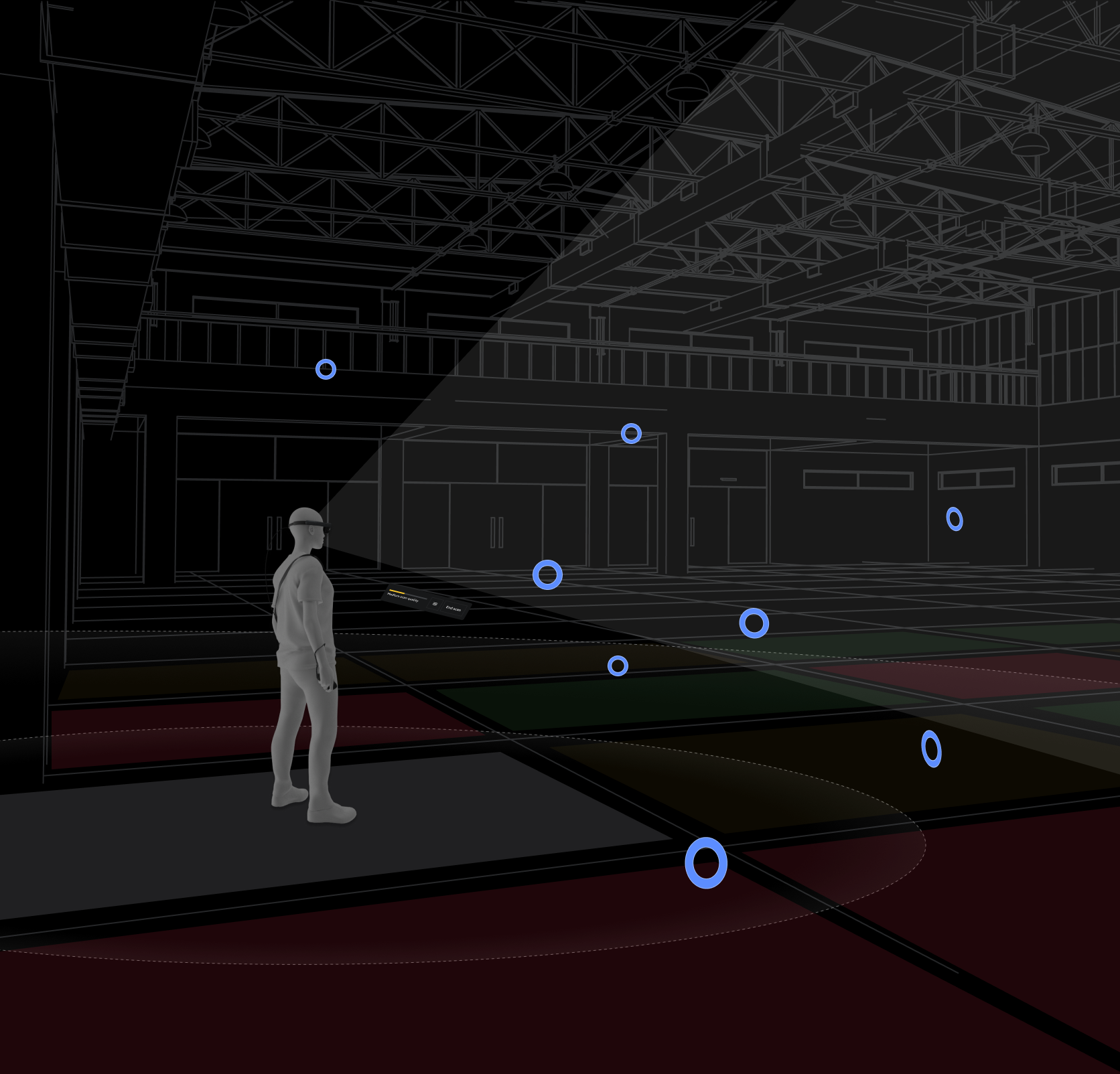
Since we had already tested multiple tools - dollhouse, wayfinders, etc - the largest remaining question was how to best populate waypoints so maps result in high quality without unnecessary user mapping. Using the disco floor system as a reference, we designed a system that spawned waypoints in quasi-random patterns in adjoining grids around the user. Tweaking the waypoint spawn positions and frequency took weeks of testing in multiple rooms and conditions. The general mood of this new mapping system was “zen,” as I wanted users to slow down and take their time (as fast body and head movements are detrimental to the quality of location data). The user moves within close proximity to each waypoint (within 2.5m) by each waypoint “beckoning” them to move closer, looks at the waypoint (for 0.5 seconds), and then the waypoint is destroyed. The user then moves on to the next waypoint, and then the next, and so on. Users follow this breadcrumb trail in whatever movement pattern they choose.
Because the system cannot understand the user's intent or the configuration of the space being mapped, we rely on the user to create their own path. All we can do is provide tools that give the user more knowledge. Tools such as voice-over and text hints to provide general guidance, a beginner tutorial system that explains what, why, and how, a HUD system that provides scan-quality feedback, and a geometric mesh that helps the user better understand how the mapping data is being utilized.
I felt that keeping the user moving forward, rather than constantly interrupting the mapping flow by telling them, “You missed this,” would reduce frustration. A refinement stage was added to inform users about areas that may lack high-quality localization data. In this stage, users would return to areas with poor data by following visual cues overlaid on the world and in the dollhouse view.
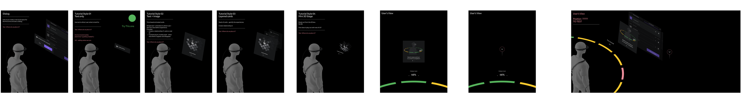
User learning
Storyboards focused on user learning using both front-end tutorials to teach how to create good scans, what to do and what to expect, when to end scanning, and what types of areas to stay away from. During mapping, a hint system was created using voiceover and text hints to provide users with general guidance while mapping since we couldn’t rely on users to read and remember the tutorial information.
Waypoints
Waypoints are 3D targets that populate the known area and are used to attract users to look at and move closer to them. The floor is divided into 3 ㎡ grids, and each grid generates four waypoints placed at semi-random widths and heights. Waypoints begin as a simple sphere, and when the user is within 5 m of a waypoint, it transitions from a sphere to a torus. When a user looks at a waypoint, it begins a beckon state that tells the user to move closer. Once a user is within 2.5 m, the waypoint scan animation occurs. This scan records the positional data needed for a SLAM map. The final stage of a waypoint is when it is “destroyed” by shrinking and sinking into the mesh. The user then moves on to the next waypoint, and then the next. Users follow this breadcrumb trail in whatever movement pattern they choose.
Early Waypoint designs
Visuals were on-brand but did not provide sufficient contrast against the underlying mesh, timing was too slow, and excessive movement of multiple elements confused users.
Final Waypoint designs
The number of waypoint states was reduced to appear, beckon, scan, and destroy. Later, a white outline was included to increase contrast visibility in environments that were bright. When the waypoint is destroyed, a ripple effect is displayed over the nearest world mesh to hint at the tight association between the two systems: waypoints and mesh.
Waypoint opacity
The number of waypoints around a user can get overwhelming, so we implemented an opacity system that prioritizes waypoints closer to the user.
HUD
The heads-up display hovers in front of the user (head-relative behavior) in the lower field of the FOV. The low location increases visibility to the physical world and waypoints, and the behavior allows users to easily look down to see progress. The physical world that the device can sense is divided into 3 ㎡ grids. A quality percentage is calculated from the average localization confidence and displayed in the HUD. This HUD quality indicator gives users the feeling of progress and indicates when they can end and save their map.
Environmental Mesh
A geometric mesh is displayed across the room geometry in case users want to scan for occlusion and/or physics. We included a few extra flourishes, such as waypoints colliding with the mesh to show a tight association between them and the mesh.
To reduce visual clutter and hide seams between sections, we simplified the mesh to a dot pattern rather than a triangulated mesh.
Refinement
In some larger environments, it’s possible for users to scan several areas poorly while scanning the rest well, resulting in a “good” quality average with areas that have low localization confidence. To address these areas with low localization confidence, we added a “refine” stage that lets users easily identify problematic areas and rescan them.
Once users select an end of their mapping, the system quickly analyzes localization confidence across the entire mapped area. If confidence is high (86% or more), they can save their map. But if confidence is low in any grid, we offer a “refine” stage. If selected, a 3D geometric dollhouse appears in the lower FOV, showing red problem waypoints within the dollhouse to indicate where problem areas occur. Overlaid on the physical space, these same red problem waypoints appear, prompting the user to clear them by navigating back to the problem area and scanning the problem waypoints. Once all the problem waypoints are cleared, the user ends the mapping session, and the device localizes to that map.
Audio
The speed at which a user moves their body and head needs to be at a “methodical” pace. Fast movements do not allow the sensors to capture positional data properly, and overly slow movement causes impatience. The audio team created an ambient music track that set a zen-like feeling to inform pace, with a multi-layer track that added complexity as the user progressed to better scan data.
User testing
I worked with the UX Research team to conduct A/B testing between the revised Hulahoop Mapping and Waypoint mapping experiences to test time-to-task, perceived goal accomplishment, and general verbal feedback (say what you see and think). The test was conducted on external testers ranging from new to experienced mixed reality users. A resounding winner emerged: the Waypoint mapping experience. All critical feedback we received concerned known issues, such as inaccurate scan quality in the HUD (the prototype wasn’t fully integrated with back-end localization algorithms). The overall feedback was very positive. Users felt a sense of accomplishment and felt that the whole experience was “gamified”.
The prototypes were not set up to provide map data evaluation, which would have to wait for final software implementation.
It was not until 6 months later that we got the go-ahead for the software team to start on the new Waypoint mapping experience... and we only had 5 weeks to implement. Thankfully, the prototypers had set up their projects so many of the systems could be brought over quickly. I had the full design spec ready to go, and the ML data team had a pipeline for evaluating map quality. Engineering implemented as much as they could, and in record time. And it helped that I spent 2 weeks at HQ sitting next to the engineers, making on-the-ground judgment calls the minute each feature was brought online.
Data testing
We could not release a new mapping experience unless we knew for sure that the data was as good as, if not better than, the previous Hulahoop experience. I set up internal tests where 18 Mapping QA and AR vision engineers located in Florida, California, and Zurich mapped office areas that ranged in size from 80 ㎡ - 200 ㎡. They each performed an A/B test where they first tested using the Hulahoop mapping and then the Waypoint mapping. The testers were directed to ignore their knowledge of good mapping practices, act like inexperienced users, and follow in-app VO and hints. They then submitted their map data and time-to-completion times to the ML data team. After analysis, the Waypoint maps were of the same quality (within a 0.3% quality range). But the biggest success was time-to-completion, with Waypoint mapping taking, on average, 60% less time, and the larger the space mapped, the greater the time differential.
Features for advanced users
We had several customers, specifically organizations that were building location-based experiences, that required bomb-proof maps that had to meet difficult requirements. The maps must work in varying lighting conditions in open-air buildings with limited architectural features. We added deeper localization and content positional data to help these organizations troubleshoot issues.
Keyviews and corresponding cloud points
Cloud points (aka map points) are unique 3D features that the WCAMs and RGB cameras can see. Any given map has thousands of these cloud points.
Keyviews (aka Keyrigs) are coordinates recorded by the device to determine its 6DoF position in the real world. Keyview accuracy is based on distance and angle from cloud points. The more cloud points associated with a single Keyview, the more localization confidence.
Developers can select a Keyview to see which cloud points are associated with it and how many overlap with nearby Keyviews. Using this rather arduous process, developers can tell where localization confidence is likely to fail and remap those areas.
Ability to view Spatial Anchors
All digital content requires a positional marker to be placed in real space, and spatial anchors serve as those anchoring points. To end users, these spatial anchors are invisible. Developers can only see these spatial anchors in code, represented by XYZ and rotation data. So we added a 3D visual representation for easier troubleshooting. If there are issues with the position of content, developers can walk to the problem area, select the required spatial anchor, and then review metadata to identify the potential problem and/or locate the problematic anchor.
Final mapping experience
Waypoint mapping
Waypoint refine