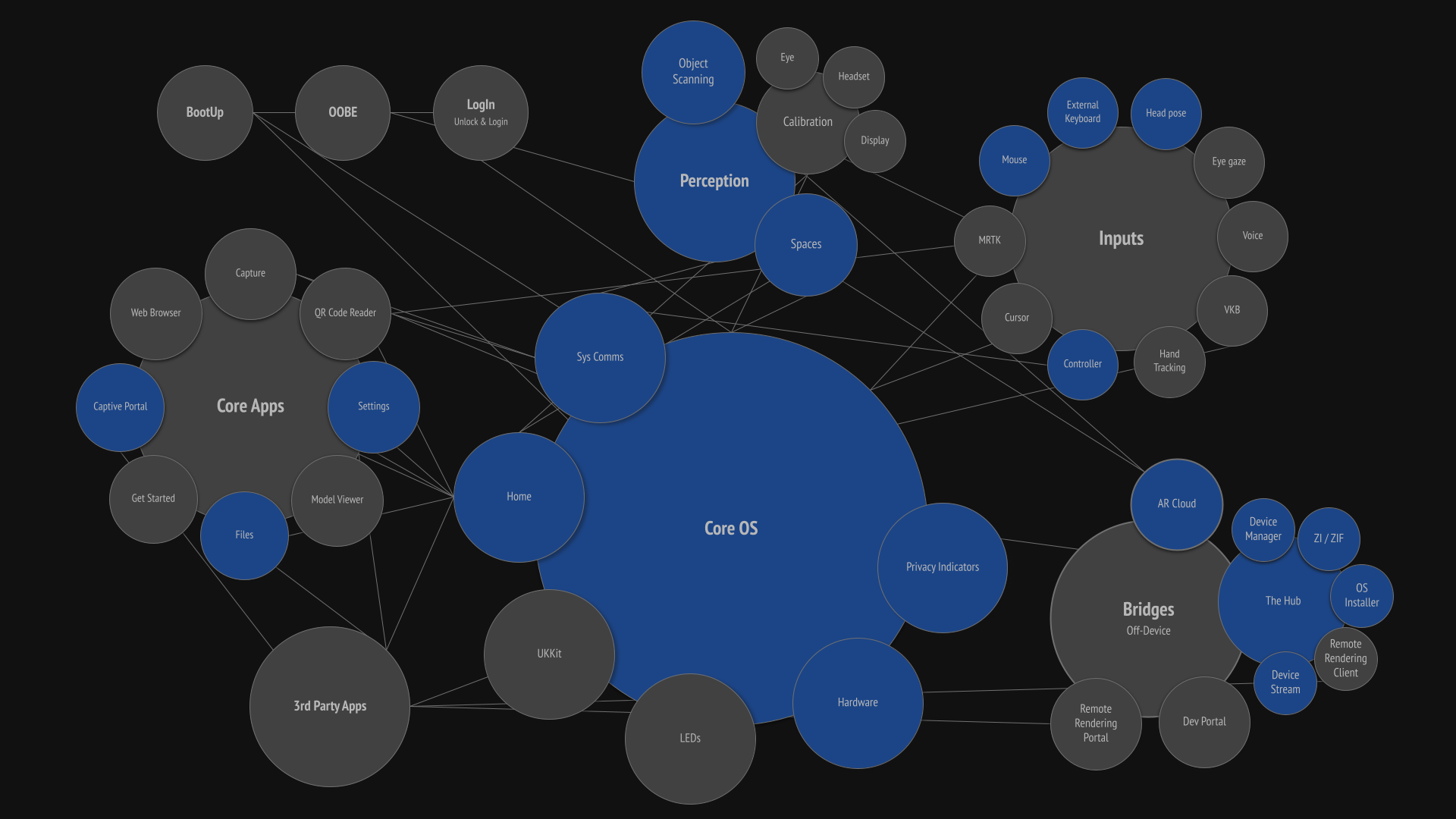
What is the Core OS?
The Core OS comprises the features, functions, communications, inputs, and apps essential to a functioning AR operating system. It is often refered to as SysUI, Platform, and World Sensing.
Responsibility:
UX Design Lead
Results:
In a closed-knit system like an operating system, every decision affects another part of the OS. Settings touched every facet of the OS: Home affects Capture; Perception affects inputs, content placement, and behaviors; and privacy indicators affect user privacy and system communications. Constantly knowing what is going on with every feature across the entire OS is essential. Working across all these features and systems at the same time was often a bit overwhelming, but it was also beneficial because I instantly understood the cascading effects of each design decision. And although I never enjoyed designing Settings, it forced me to know every facet of the OS.
We were able to ship, maintain, adapt, and refine a first-class AR platform that users not only found useful but also enjoyed. The platform was on time, on budget, and completed with a small team. And the OS was adaptable enough to later include alternative inputs like gestures, eye gaze, and voice. The first iterations were a little scrappy, but slowly over the next two years, we expanded the AR platform with motion design, expanded options, tested and proven behaviors, and proper feedback systems. And we all learned a LOT along the way.
Core OS features
To be clear, I was not the design RI for the entire Core OS; that job is just too big. However, I was the overall RI for Core OS (often referred to as SysUI and Platform), and other designers took ownership of specific components.
I was the UX Design Lead for these features:
Device communications: toasts, notifications, dialogs, and permissions
Settings: user preferences and device status
MDM: Mobile Device Management for enterprise orgs
Dimming: global and segmented dimming
Home: central main app launcher
Perception: how the AR device understands the physical environment and how users understand this ability
Files Manager: File management app
Licensing: Enterprise and developer pro license
Multi-user: Shared device setup, login, and user profiles
Peripherals: Controller setup/disconnect & button assignments, external keyboards/trackpads/mouse, audio headphones/earbuds/speakers, storage HD & SIP/SOP
User privacy: systems (privacy indicators and app permissions), standards, Headset LEDs, and sensor data
Power management: power states for the device and the controller
Bluetooth and USB connections
60601-b compliance: medical compliance for hospital operating rooms
Developer HUD: Heads-up display used by developers to diagnose frame rate, GPU, CPU, and thermal diagnostics
I was NOT the Design RI for these features:
Bootup
Calibration: Eye and headset calibration
OOBE: out of box experience
Inputs: Cursor/6DoF ray, hand tracking, voice, eye gaze
Compute Pack and Controller LEDs: hardware lights that show status
Capture: screen and video capture
Iris ID: Iris scanning and device unlock
Virtual Keyboard
Device setup: new device setup for individuals and enterprise
Accessibility
Learning: tooltips, learning modals, and tutorials
Design lead for features shown in blue
The list of Core OS design responsibilities was extensive, and each system and feature required me to address them in different ways. But in general, I followed design best practices through discovery, analysis, ideation, prototyping, and testing whenever possible. Not only did this general process give me a skeleton to hang data on and make informed design decisions, but it also helped other teams understand what decisions were made and why, and allowed the design team to come alongside me and critique with adequate knowledge.
Discovery
The Magic Leap 1 had been launched a few months earlier as a consumer-focused device that used proprietary hardware and software. The ML2 was a whole new company shift, with a focus on enterprise customers and use cases, off-the-shelf hardware, and an AOSP software base. We had to rethink everything.
I began as the design lead for the Core OS, so there was a large body of functions to review and audit, along with a smattering of internal and external user feedback. Not all Core OS systems were on ML1, but for those that were, previous designers had done a good job of documenting design decisions and testing feedback. I audited what worked well and what we could improve, and I pored over and practically memorized previous designs for these systems.
Although we were building an optical see-through AR device and there were very few existing design patterns for me to regurgitate, using patterns known to users brought familiarity and reduced the need for users to learn. So I reviewed and audited platform OS systems for iOS, OSx, Android, Windows, Quest, etc.
Analysis
User Stories & Personas
Magic Leap is an engineering-led company, and as such, its use cases are sterile, multi-page documents that focus on business objectives and technical systems but don’t delve into user needs. They are then written as one-sentence descriptions for individual projects, and personas are described solely by job title. It ends up being a “checkmark” to be written as fast as possible.
These use cases tend to be focused on solving customer and user needs with a direct approach, with little thought given to “why” and going straight to “what”. So at the beginning of every design, I start by building at least three detailed user stories. I fully write out these user story descriptions, including the user description (persona), user's full flow of steps they take to accomplish a task or workflow, and user journey. I’ve found that this is a great tool to ensure the entire team (software, hardware, legal, security, product management, project management, and design) is all on the same page because it breaks down the problem from a user perspective and delves deeper into “why”. In fact, on every project, I would spend an entire weekly meeting reviewing use cases and would make sure each lead agreed to the user story to help ensure alignment. When questions arose later in development, we could always refer back to these user stories to better understand intent. Plus, they help inform content by breaking down workflows into steps.
Example user story for Spatial Mapping
Needs, features, and content
Through reviewing use cases and auditing previous and competitor designs, I would build out a prioritized list of needs, features, and content.
Example of content from Home project
Ideation
Depending on the system being designed, ideation varied based on my starting point. Among the examples found below, I’ve included short ideation, prototyping, and results blurbs for a few select CoreOS projects.
Reviewing
Reviews occurred throughout the design process. When you’re working out there in the white space, you need to continually check your assumptions. On a weekly basis, we held working critiques with the UX design team for everything from written use cases and copy to user testing protocols and wireframes. I have always felt that these frequent reviews help me gain a wider perspective, and I often glean information or ideas I would never have thought of. At least every two weeks, UX flows, ideas, and findings were shared with design leadership just to keep us honest. New thoughts and ideas, flows, and elements were continuously folded back into ideation.
Process
It’s important that an entire design team - however large or small - speak with one voice and follow the same processes in order to best communicate with the rest of the development teams, legal, security, product management, project management, SDK, software, and QA. To do so, we needed processes. Throughout the early designs for CoreOS, I led our design org processes: building design spec templates, creating protocols for prototyping and internal user testing, documentation, meeting formats, and communication plans. Having done this for my previous companies, I not only felt strongly about doing so but was familiar with how to accomplish it.
Device communications
Toasts, notifications, dialogs, confirmations, and permissions were designed from the ground up to reduce a “talkative” system. Auditing, categorizing, and removing any non-essential comms are essential for a heads-up spatial computer because comms are much more invasive than existing software platforms. I ended up simplifying device communications and designing separate behaviors for each communication type based on user attention and content size. I built a process where any department within Magic Leap could submit a comms request, which would then be reviewed, copywritten, and have design rules and icons attached and ready for software implementation.
Notifications timing prototype
System communications simplification and prioritization
System communications UI design
System communications behaviors prototype
User Privacy
privacy indicators, app permissions, and headset LEDs
UX/UI design for privacy indicators was pretty straightforward, consisting of initial design, motion studies, behavior design, prototyping, and testing. The final documents included design, comparables, user privacy positions, best practices, developer portal documentation, and company legal statements.
The real issue was working with legal to create a company position on user privacy. Company leadership was tasked with profit goals and ensuring the needs of enterprise customers were included. Product was focused on 3rd-party developer needs. Software was tasked with GPU/CPU computation and running systems to show an overlay across multiple engines. Legal was tasked with ensuring Magic Leap was protected from prosecution. That left Design - aka me - to advocate for the end user and bystanders within the user’s device's view. I wrote several documents to illustrate good user privacy practices, showcase existing examples, and provide explanations of “the LED conversation” that occurs between device users and bystanders. I did whatever I could to talk to varying internal audiences about the importance of protecting end users. In the end, I was able to clearly convey pertinent information to stakeholders and achieve end user-focused concessions to better inform and protect them in order for the end users to make the best decisions for themselves and those around them.
Privacy indicators animation example
Permissions dialogs
Settings
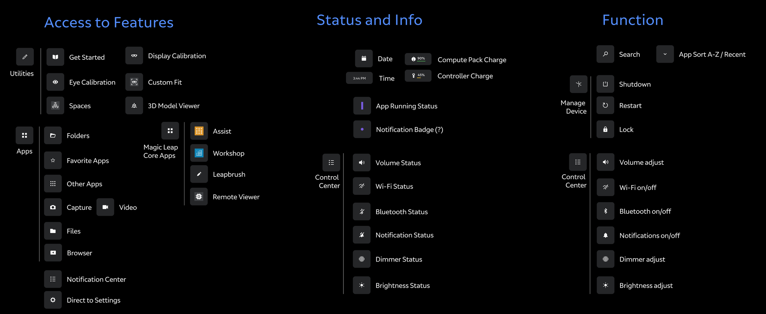
When I first began working on settings, it was custom-built into Home, which was great for design as we could ideally customize all interactions to work with AR. About 6 months later, software leadership decided to use AOSP (Android Open Source Project) as our foundational engine. In some ways, this decision made my job easier, since most settings were included in the package. However, the biggest challenge with AOSP was that it was built for flat screens and had no awareness of 3D space or multimodal input paradigms. To solve this issue, I worked with prototyping to test out AR overlays and behavior sets that worked across mutiple AOSP apps, and then software engineers translated these prototypes into an optimized production version. I made minimal information architecture changes to better suit our own device, and then worked with the visual design team on AOSP UI templates. I worked with project management to create a process to account for settings requests coming from over 20 different teams. Teams would create a Jira ticket and tag it for settings UX, which would then appear on my Confluence dashboard and then be included in the next release's design spec. This process was monumental since before this process, I had to attend and monitor over 20 meetings per week to ensure I captured each setting’s needs.
And then for the next five years, I added, moved, and changed UX flows and systems as new features came online with each OS release.
Early information architecture restructure
Factory reset UX flow
OS Update UX flow
Dimming
The Magic Leap 2 is an additive display, meaning it cannot render black, and dark colors have high transparency. In our UI, we compensate by using bright colors to increase legibility. But in bright environments, or if we want to show content - especially videos - with rich color, the system needs to render blacks. Magic Leap innovated a “dimming” system across two lenses. One lens is a Global Dimming system that tints the entire display to adapt to bright or dim environments. The other lens is Segmented Dimming, where large 80x80-pixel segments tint 256 shades across the entire FOV, primarily for use behind individual content elements so users can easily see both the physical world and high-contrast digital content. Pretty cool tech, but we had no idea how and when to effectively use Segmented Dimming, how to communicate proper implementation and best practices to developers, what the rules for 3rd-party apps and overriding user settings should be, or how to communicate to end users what it was and how to set it.
I started with several meetings with the hardware dimming team to better understand what dimming was and to review their test cases. I then worked with our own prototypers to set up a series of content tests that allowed full customization of Global and Segmented Dimming preferences across varied digital content.
This prototype gave us insight into what it takes to effectively implement a Segmented Dimming shader pipeline, and which sizes, shapes, and distances work best as well as which do not. I wrote up my findings and implementation documentation for the developer portal.
Through UX research testing, we found that end users had trouble understanding the benefits of dimming and how best to combine Global and Segmented dimming for specific environments, digital content legibility, and use cases. We came up with dimming presets called “Display Modes”. Display Modes combined Global and Segmented Dimming tints to provide pre-set values that clearly explain benefits to users. These mode presets were then brought into both Home and Settings.
Finally, I worked with our developer relations team and our legal department to provide guidelines and best practices for device dimming when developing 3rd party apps, as well as guidance on how to best handle overriding user preferences.
Home display modal w/ & w/o preset modes
Dimming settings in Settings app
Files Manager
Files was the first Core OS app I was the RI on at Magic Leap. At the time we were still chasing the consumer market and two years before adopting AOSP. Generally, designing and building a file management app is pretty standard stuff, but reimagining it in mixed reality kind of blows the doors off when it comes to how users can view, manage, and interact. So how does someone keep things familiar and yet take advantage of this whole new paradigm of computing?
I first worked to understand how users currently manage files, and what sort of control they are comfortable with. I reviewed and audited Android, iOS, HoloLens, OSx, Windows, and Dropbox. I then sat down and interviewed over 40 Magic Leap employees about what they like and don’t like, which systems they use, and which functions they find most beneficial. Interestingly, my findings found that file navigation and management preferences are almost generational. Younger users prefer simple, limited features and quick algorithmic sorting based on frequency, as is common in mobile operating systems. Older users (myself included), prefer more custom controls and features found in desktop operating systems, and like to know exactly where all their files are located.
I then wrote every potential use case and extracted the needed functions. Users need to delete, move single or multiple files, create folders, sort by multiple parameters, move files to external locations (ie GDrive), rename, etc.
I explored multiple navigation paradigms: left nav, top nav, and combos. I then moved on to wireframe explorations for list views, grid views of all kinds, combining grid and list, z-depth drill-down modals, filtering systems, etc.
I was only able to take File Manager to the prototype phase, and then the project was shelved. Magic Leap made a major shift into the enterprise market, which required a complete rethink of the File Manager. Two years later, we moved to AOSP, which already came with its own fully integrated flat-screen file manager. That project, which I did not work on, was much simpler, as only minor adaptations were required, with the heavy lifting done by the AOSP AR overlay I had helped design for Settings. In the end, the file manager app is not well-suited to AR, and users tolerate it. It works, but it is just reduced to a floating screen that receives input via Controller, gestures, or voice.
Visual exploration of early file manager
File manager functions grouping
Navigation positioning
Early spatialized file manager prototype
Licensing
The Magic Leap 2 offered two types of licenses: Enterprise and Developer Pro. When licenses were rolled out internally within Magic Leap, it was a typical case of investors saying, “We need to figure out more ways to generate revenue”, a revenue officer building out a spreadsheet, and then pushing it down with a tight timeline. Product then says, “Just put it in, and we will figure out the rest as we go along”. Everyone knew it would be a problem because it touches so many orgs and partnerships. Unfortunately, no one in Product really took ownership of it.
As the design lead for settings, I regularly collaborated on UX flows to enable device licensing and unlock device features. Additionally, I was the design lead for AR Cloud, spatial mapping, and remote rendering - all systems that are enabled through licensing. So, at the user level, I was sensitive to how and when things were implemented and to the resulting UX flows. Systems like device licensing need to be fully roadmapped before design begins, but we were doing it in small pieces with each release without a roadmap. With each release, engineering and I were redesigning previous UX work to make new features fit, resulting in even more work. And the more I talked to ML Customer Care and Developer Relations, the more I found that customers were not buying into licensing.
Sometimes it’s beneficial to be the only Principal Designer at a company like Magic Leap, where we are not segmented into separate domains because if you see an issue, you can step up and take ownership of it. As a Principal, I can wield a decent-sized megaphone. So I did a full audit of licensing. And when I say full, I mean auditing everything from messaging and outside channel partners to select customers, customer care, developer relations, licensing software, and design. I recreated all existing journeys for customer discovery, license enablement and activation, and license exchange to illustrate problem areas, handoffs, and communication gaps. I interviewed parties from across the org, customers, and outside partners. I recorded observations, documented findings, and reviewed internal and external documentation. And then finally wrapped up with my recommendations.
And I found BIG holes in every facet. Our own website had inaccurate information and did not clearly define the benefits of licensing. Our channel partners - who actually sell our devices - were either not aware of licensing or had an unclear picture of what licensing was or how to sell it. Our customers either did not see the value or did not know how to activate licensing. Customer Care did not have an efficient or scalable system to manage licenses across multiple organizations. Developer Relations did not have any agency to take care of licensing issues or documentation. And end users did not have streamlined flows for enabling licenses, knowledge about what licensing features were enabled or how to activate them.
I shared this audit with the Product team, and then it quickly escalated to top management. Over the next three OS releases, we fixed each and every software and design issue. Customer Care and Developer Relations created thorough user-facing and internal-facing documentation and systems. Our Channel Sales teams attended a licensing workshop and then worked with our distribution partners to train their own sales teams. Our Marketing and Brand teams updated our company website with accurate information that clearly showed benefits and use cases. And although not all of my recommendations were adopted, we did see growth in the number of customers purchasing and using device licenses.
Before my audit, only about 1 in 12 devices had an associated license. And of those devices that had an associated license, only half activated it. AR Cloud - one of our main license features - only had two regular enterprise users and an abandon rate of over 80% (due to the difficulty of setting up and maintaining an AR Cloud instance and poor developer relations training). Within 6 months of wrapping up licensing enhancements, about 7 in 12 devices had an associated license, device license activation was near 100%, 12 new AR Cloud instances were active, and Customer Care tickets regarding licenses were down by over 60%.
It was a big effort for everyone involved, and it all started with a little frustration and a three-week audit.
Revised license activation flow found within Settings. This new flow - only a small part of the overall restructuring of licensing - enabled easier discovery, easier activation through QR code scanning, and a checklist with deep links to enabling license features across the device.